How to check and improve a Website Colour Contrast Score
Enhancing color contrast on your website is crucial for accessibility and overall user experience. Improved color contrast ensures that text is readable and elements are distinguishable, which not only benefits users with visual impairments but also enhances the overall aesthetic and usability of your site. This guide will walk you through various methods and tools to achieve optimal color contrast, thereby improving your website score.
Our top 3 recommended colour contrast checker
- Coolors: Integrated with a powerful color scheme generator, making it ideal for designers working on cohesive color palettes.
- Siegemedia: Simple and effective, with a minimalist design. It's particularly useful for those who want a quick and efficient way to check contrast without any extra features.
- WebAIM: Simple, straightforward, and provides clear results. It also shows how to adjust the colors to meet accessibility standards if they don't already.
Link to the individual Colour Contrast Checker:
1. Understanding Colour Contrast
Understanding the basics of color contrast is the first step towards improving your website’s accessibility. Color contrast refers to the difference in light between the foreground and background elements of your site. Proper contrast ensures that text and other elements are readable for all users, including those with visual impairments.
According to the Web Content Accessibility Guidelines (WCAG):
By adhering to these guidelines, you can ensure that your website is accessible to a broader audience, enhancing usability and improving your overall website score.
- WCAG 2.0 Level AA requires a contrast ratio of at least 4.5:1 for normal text and 3:1 for large text.
- WCAG 2.1 extends this to include a contrast ratio of at least 3:1 for graphics and user interface components.
- WCAG Level AAA demands a higher contrast ratio of at least 7:1 for normal text and 4.5:1 for large text.
2. Convert with a Command Prompt
To ensure your website meets accessibility standards, you need to check the current color contrast between your text and background elements. This process helps identify areas where contrast may be insufficient, impacting readability and user experience.
Steps to Check Colour Contrast:
By regularly checking and optimising your website's color contrast, you can ensure a more accessible and user-friendly experience for all visitors.
- Use Built-in Browser Tools: Modern browsers, such as Google Chrome, have built-in developer tools that can check color contrast. Open your website, right-click on the page, and select "Inspect" or press Ctrl+Shift+I (Cmd+Option+I on Mac). In the "Elements" tab, select an element and view its color contrast ratio in the "Styles" panel.
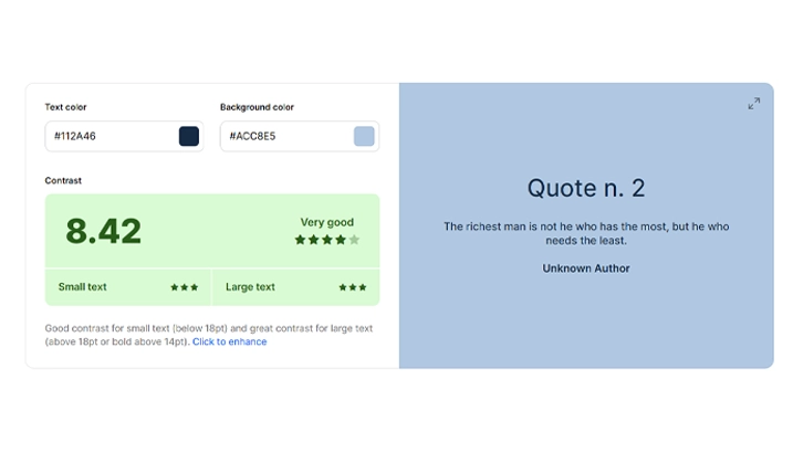
- Manual Testing: Visit Coolors Contrast Checker, and enter the hex codes for your text and background colors. Coolors will display the contrast ratio and indicate if it meets WCAG guidelines. Adjust the colors if necessary and recheck until you achieve a compliant contrast ratio.
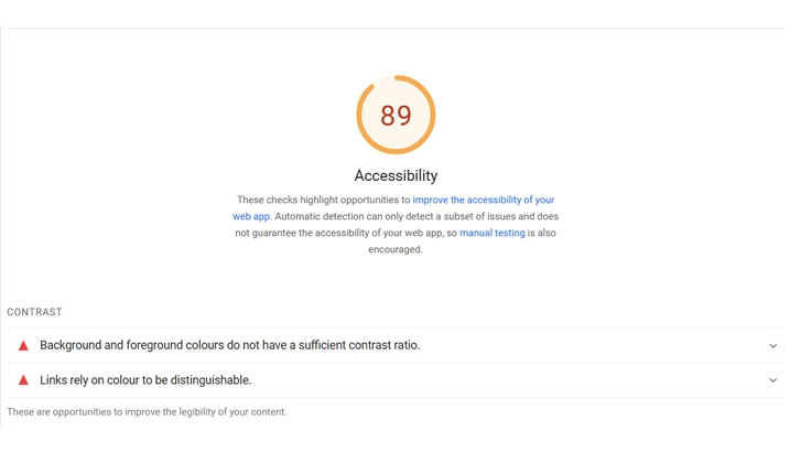
- Check Page Speed Insights: Google’s PageSpeed Insights not only analyzes your site’s speed but also highlights accessibility issues, including insufficient color contrast. Run a test on your website, and review the "Accessibility" section for any contrast-related warnings.
- Automated Accessibility Audits: Tools like Lighthouse, integrated into Chrome DevTools, can audit your website for accessibility issues, including color contrast. Run an audit and review the results to identify and address any contrast problems.
3. WordPress plugins designed to help with color contrast and accessibility
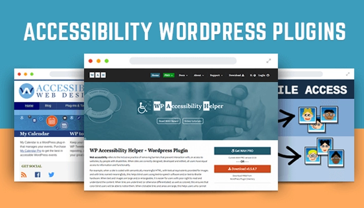
WP Accessibility:
- Description: This plugin helps improve the accessibility of your WordPress site by addressing a variety of common issues. It includes a color contrast tester, among other features.
- Features: Color contrast checker, alt attribute enhancements, skip links, and more.
- Pros: Comprehensive accessibility tool that addresses multiple accessibility issues, not just color contrast. Easy to use and configure.
- Link: WP Accessibility on WordPress.org
Accessibility by UserWay:
- Description: This plugin offers a suite of tools to enhance the accessibility of your website. It includes features like a color contrast checker, screen reader, and keyboard navigation improvements.
- Features: Color contrast checker, screen reader, keyboard navigation, and more.
- Pros: User-friendly interface and a comprehensive set of tools to improve accessibility.
- Link: Accessibility by UserWay on WordPress.org
One Click Accessibility:
- Description: This plugin makes your WordPress site more accessible with just a few clicks. It includes a color contrast checker and other accessibility features.
- Features: Color contrast checker, accessibility toolbar, skip links, and more.
- Pros: Easy to set up and use, with a focus on making accessibility improvements simple for site owners.
- Link: One Click Accessibility on WordPress.org
4. Additional Tips and Best Practices
Improving color contrast is crucial, but there’s more you can do to make your website truly accessible and user-friendly. By following some additional tips and best practices, you can create a more inclusive and enjoyable web experience.
4.1 Consistent Use of Colors:
Ensure that your website uses a consistent color scheme throughout. This consistency helps users quickly understand and navigate your site.
4.2 Preview palettes on designs:
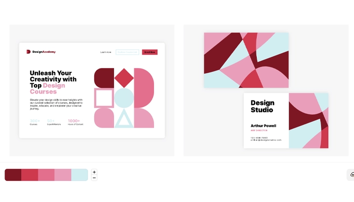
Before finalising your color choices, preview your palettes on your designs to see how they look in real-world applications. You can use tools like the Coolors Visualiser to test your color schemes. This allows you to ensure your chosen colors work well together and meet accessibility standards before implementing them on your site.
4.3 Explore popular palettes:
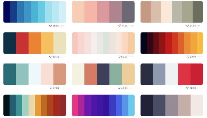
Explore Popular Colour Palettes or see our Coolours Review to find inspiration and ensure your color choices are both trendy and accessible. These palettes are already designed to meet accessibility standards, saving you the hassle of manually checking each color combination. Simply browse through the selection to find appealing and compliant color combinations.
